

Why UX shapes the success of route optimization tools
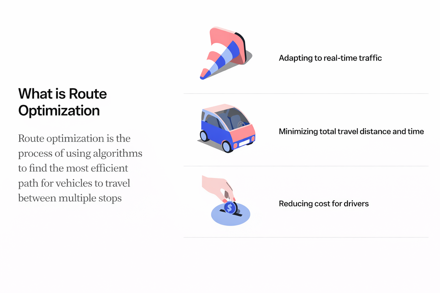
Route optimization often sits at the intersection of efficiency, safety, and user trust. Although many of us rely on tools like Google Maps or Apple Maps in our daily lives, working closely with route optimization from a product and UX perspective highlights how essential thoughtful design is for professional users who rely on these tools to carry out their work. The goal is not only to calculate a path from point A to point B, but to support the people responsible for traveling that path throughout their day.
This article explores UX observations and design considerations that shape effective route optimization.
Looking at familiar navigation tools
Analyzing leading navigation apps provides practical insight into the patterns that make routing intuitive. Google Maps, with its large global user base, organizes information through clear visualization, structured hierarchy, and strategic use of color. Pathways are differentiated in a way that helps users understand options at a glance. Real-time trip duration updates as stops are rearranged, which can make experimentation easier for users.
Apple Maps takes a different approach, favoring minimalism and familiar visual language. Color accents highlight types of locations, and simple icons guide the user through basic tasks such as adjusting stop order or adding new stops. Both tools rely on clarity, flexibility, and a strong sense of what the user needs to do next.
Studying these patterns highlighted principles that can help inform route optimization in healthcare solutions. Visual hierarchy, user flexibility, and clear calls to action consistently stood out as essential.
Route optimization designed for clinicians and case managers
We'll look at how WellSky® route optimization supports two primary user groups in healthcare: case managers and clinicians. Case managers prepare schedules, enter details that inform appointments, and handle edits before routes are handed over to clinicians. Clinicians rely on the tool during their day, adjusting times, reordering visits, and confirming that their route reflects real conditions.
Anchoring the design in these personas helped prioritize what the tool needed to communicate. For case managers, visibility is key. The weekly calendar view provides a complete picture of a clinician's workload, including appointment types, total visit time, and productivity points. This makes scheduling more informed and reduces the risk of overloading staff.
Visualizing optimized routes
One commonly referenced screen in user conversations is an optimized route view that presents time saved, miles saved, and total distance in a way that is simple to interpret. The map remains visible in the background for context, while color indicators distinguish current routes from optimized ones. Users can clearly see what changes the system suggests and how those changes benefit them.
After optimization, the schedule times interface enables fine tuning. Users can accept recommended times or adjust appointments through an intuitive drag interaction. The design keeps the primary action, saving the schedule, straightforward and easy to find.
The broader impact
As demand for in-home care grows, clinicians spend more time on the road. Thoughtful route optimization can decrease burnout, reduce operational costs, and support better patient experiences. The UX is a central part of that process because it shapes how effectively users can understand, adjust, and trust their routes.
Well-designed systems enable clinicians to stay focused, support case managers to work more efficiently, and ultimately deliver better outcomes for patients. Route optimization is a technical challenge, but its value is fully realized when the experience is clear, flexible, and supportive of the people who rely on it every day.
